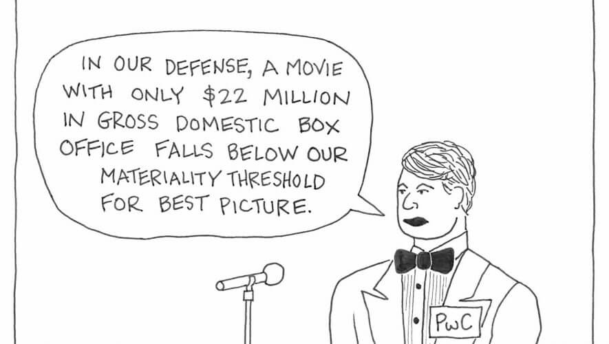
I was screwing around on Pinterest earlier today because it's a slow Friday (and a half Friday at that, at least for us, so barring some huge accounting scandal at 4:01 PM, find me at the bar later this afternoon) and got really enraged by PwC littering up my screen with their obnoxious graphics.
Exhibit A:

Ugh, my eyes. I guess it's my fault for using the official Going Concern Pinterest for what it is for instead of following a bunch of future brides brainwashed by the Wedding Industrial Complex and food bloggers.
Anyway… just as I was about to take to Twitter to berate PwC for their far-too-consistent graphic design, What Your Logo's Color Says About Your Company (Infographic) popped up on Twitter:
When it comes to identifying your brand, your logo is probably the first thing your customers will think of.
While honing the narrative and message behind your logo should of course be your primary concern, research suggests that your logo’s design–and specifically its colors–have more bearing on your customers’ opinions than you might think.
Neuroscientist Bevil Conway, who has focused his recent research almost entirely on the neural machinery behind color, believes the science behind color processing to be very powerful and completely underexploited.
“Knowing that humans might … be hardwired for certain hues could be a gateway into understanding the neural properties of emotion,” he told Co.Design earlier this month.
If you didn't know this about me, I have a background in graphic design/illustration. Were I not steering this little ship of ours, I'd probably be cranking out logos and business cards for second rate startups at this point in my life (instead, I get to use my skills to put Big 4 guys' heads on other bodies). So I notice design and PwC's in particular is absolutely irritating. They've taken the brand continuity thing just a tad too far but we'll leave that for another day…
The Fast Company article included an interesting bit on color. Did you ever notice how each Big 4 firm favors a different primary color? Let's take a look at what that means.

They don't call Deloitte the Green Dot for nothing. As we all remember from middle school, green M&Ms mean horny but green is also associated with — duh — nature, money, and health.

Dudes love blue and so does KPMG. Painting your dining room blue may encourage you to eat less but when it comes to corporations, blue is relatable, trustworthy and chill.

Yellow makes babies cry? Hilarious. It also makes the EY logo what it is — since before they made the unfortunate marketing choice of sharing a name with a twink mag. Yellow is also considered a cheerful color, which may be why EY thought handing out sunny little stress balls during busy season would chill their stressed staff.

We didn't know whether to go with red or orange for PwC because their new-ish autumn theme is really neither. We went with red because red is the color of passion and as we all know, PwC is nothing if not passionate. They've been throwing in a little pink lately, which is a nice change from that burnt orange nonsense. But red. Lots and lots of red.
So next time you're staring at your business card cursing that ugly logo, keep in mind that there is science behind it and your keepers are more than aware of the power of color.


